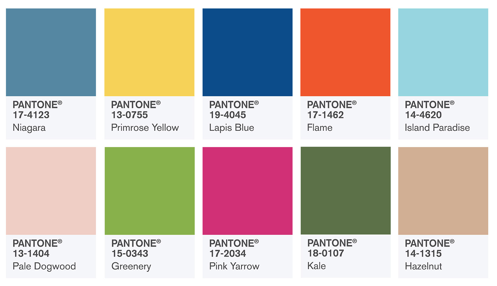
By now you’ve probably been seeing Pantone’s trending colors translated into decor products from toss pillows to paint. We’re loving these fresh hues for summer from Flame orange to Pale Dogwood. If these latest colors have caught your attention, how will you be using them in your home or office? Below we’ve collected some of room images to correlate with each of Pantone’s lead colors above.
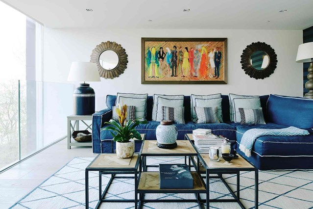
Niagara is a demin-like color that is both casual and comfortable. It makes for a welcoming sofa upholstery like in this living room or calming duvet in the guest room.
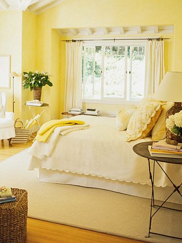
Primrose Yellow is sure to brighten any room as evidenced in the bedroom here. We love walls awash in this crisp and happy hue.
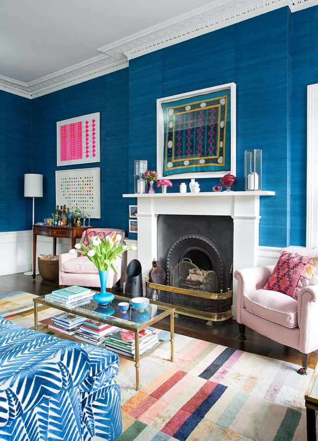
Lapis Blue is bold and brilliant in this transitional living room. Whether you go for all over color or touches here and there, this becoming color will make your room pop.
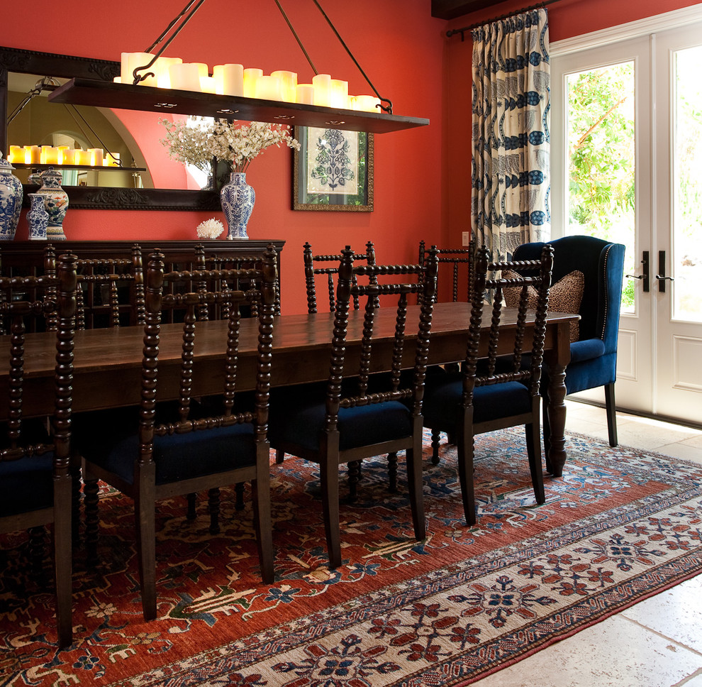
Flame is fiery and fierce on the walls and rug in this old world style dining room.
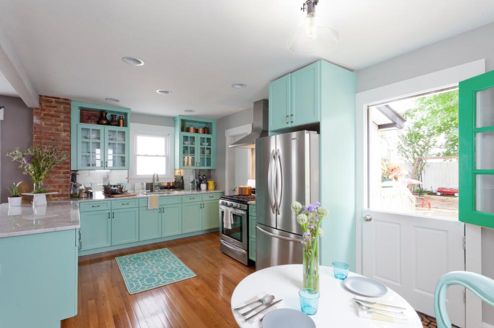
Island Paradise is fresh and fabulous bringing a coastal feel to this kitchen. If you don’t want to commit to painting cabinets in the pretty color, consider incorporating with daily dinnerware and accents.
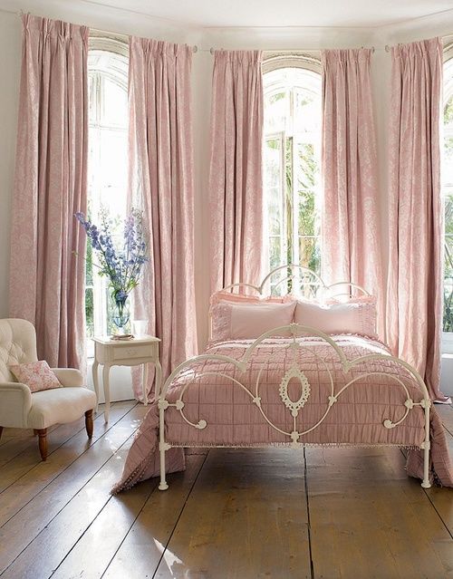
Pale Dogwood makes for a serene and calm bedroom with its blush like color.
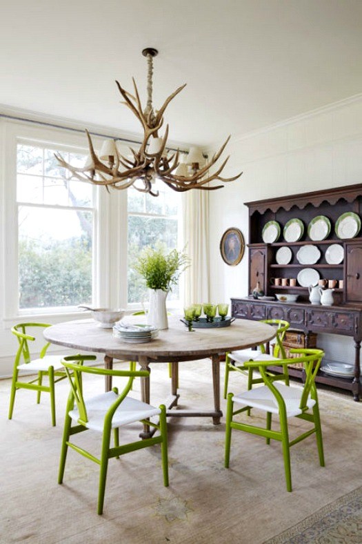
Pantone’s color of the year for 2017 is a nature-centric green with brilliant presence. Here just a pop of this bright color on the dining chairs amps the energy of the space.
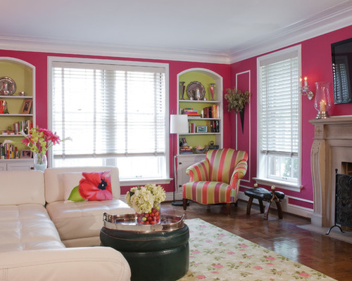
Pink Yarrow packs an pretty punch with its sassy look. Here the walls are painted to contrast with crisp white trim and ceilings.
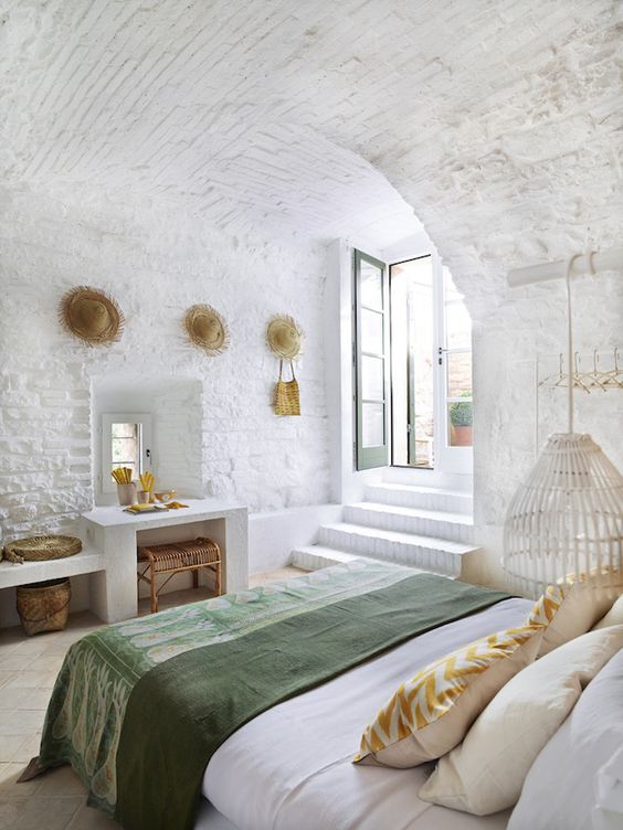
One of the more subdued hues in this collection, Kale is natural and relaxed ideal for use in any room you want to chill.
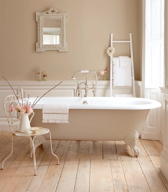
This soft vintage inspired hue is ideal for those who love neutrals.