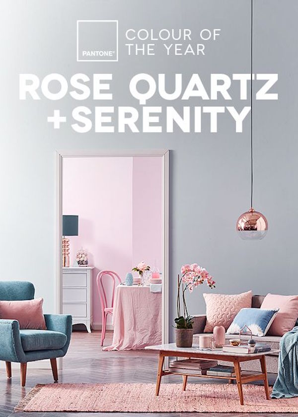
Pantone tells us its 2016 color pairing is, “A symbolic color selection; a color snapshot of what we see taking place in our culture that serves as an expression of a mood and an attitude.”
Additionally, we’re told, “For the first time Pantone introduces two shades, Rose Quartz and Serenity as the PANTONE Color of the Year 2016. Rose Quartz is a persuasive yet gentle tone that conveys compassion and a sense of composure. Serenity is weightless and airy, like the expanse of the blue sky above us, bringing feelings of respite and relaxation even in turbulent times.”
Even if you do not consider yourself a pastel kind of person, we’re seeing some compelling uses of this soft pink and blue duo. We hope you enjoy some of our favorite room images.
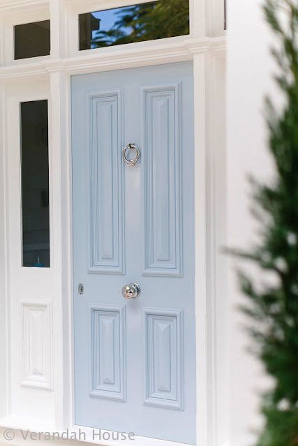
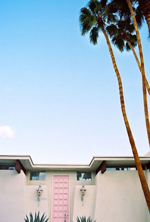
Shall we begin at the front door? Serenity Blue and Rose Quartz seem to fit well into many design styles. From traditional (as seen above) to contemporary or this Mid-Century modern restoration.
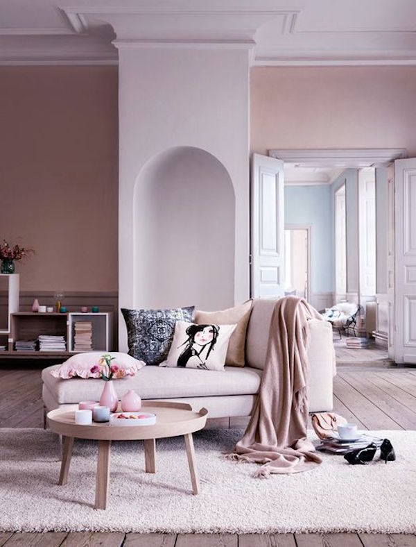
This historic home with contemporary furnishings features pastel pink in one room and pale blue in an adjoining space.
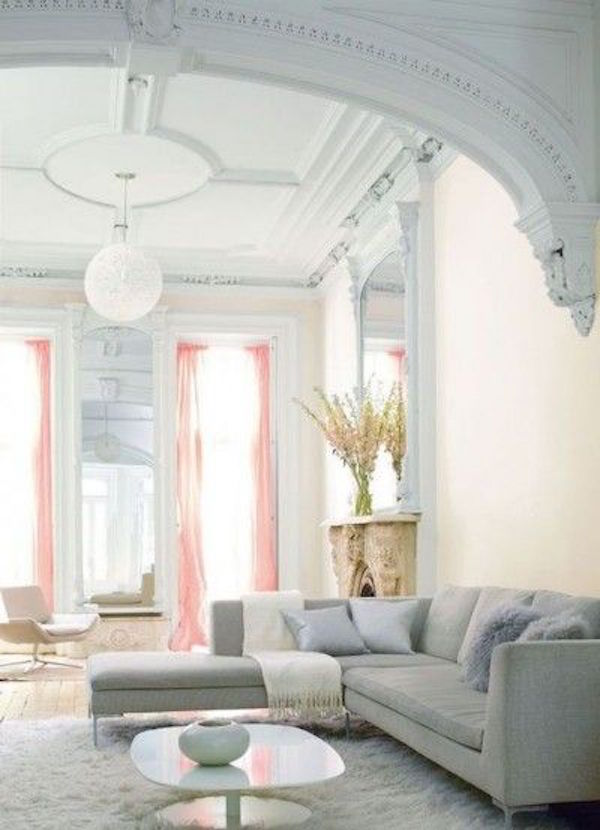
Here again, Rose Quartz and Serenity Blue bring a stylish updated look to a home filled with historic architectural elements.
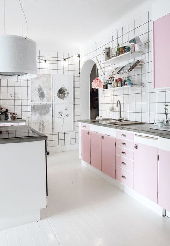
Who knew a pink kitchen could be so fabulous. Consider how beautiful pale blue cabinets might be. Equally stunning, don’t you think?
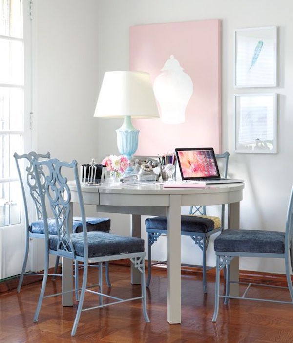
Pink and blue meld beautifully to create an eclectic dining room that turns into a home office with both form and function–an all together genius use of space.
This lovely bath combines lots of blue hues (including one that’s very close to Serenity) to the space into a warm and welcoming retreat.
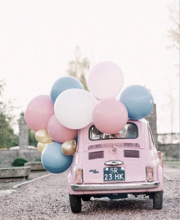
So, we goodbye for now and send you off to explore the world of Rose Quartz and Serenity Blue. Have a great journey!
Sources: Blog.TempleAndWebster.com.au; VerandahHouse.blogspot.com.au; MademoiselleVuitton.tumblr.com; Pinterest.com; CocoRepublic.com.au; CasaVogue.globo.com; StyleAtHome.com; JacquelyncCark.com; CandyPopStyle.blogspot.com.